By Stine Winther
My bachelor project for Digital Concept Development was created in a cooperation with By Stine Winther.
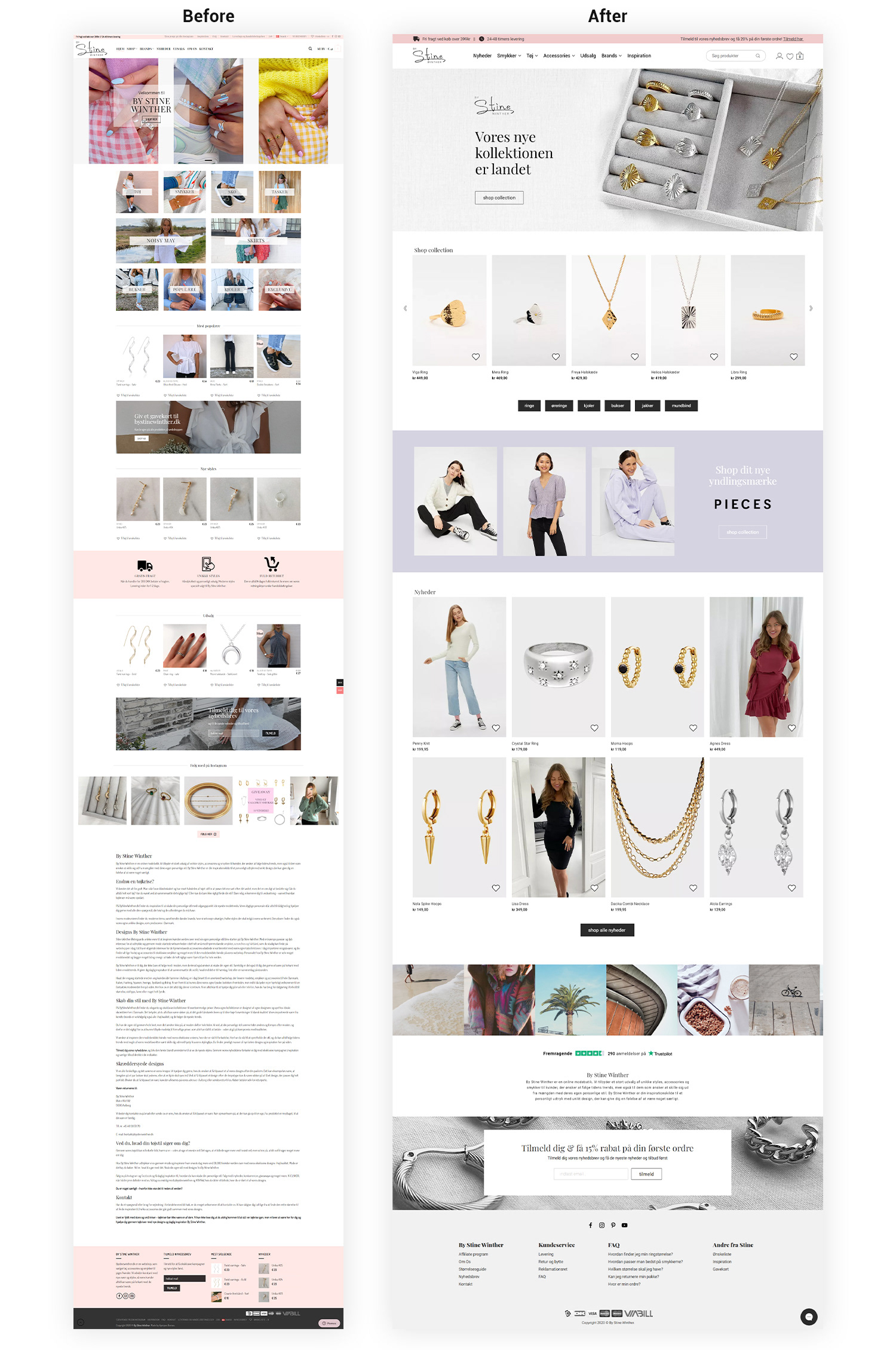
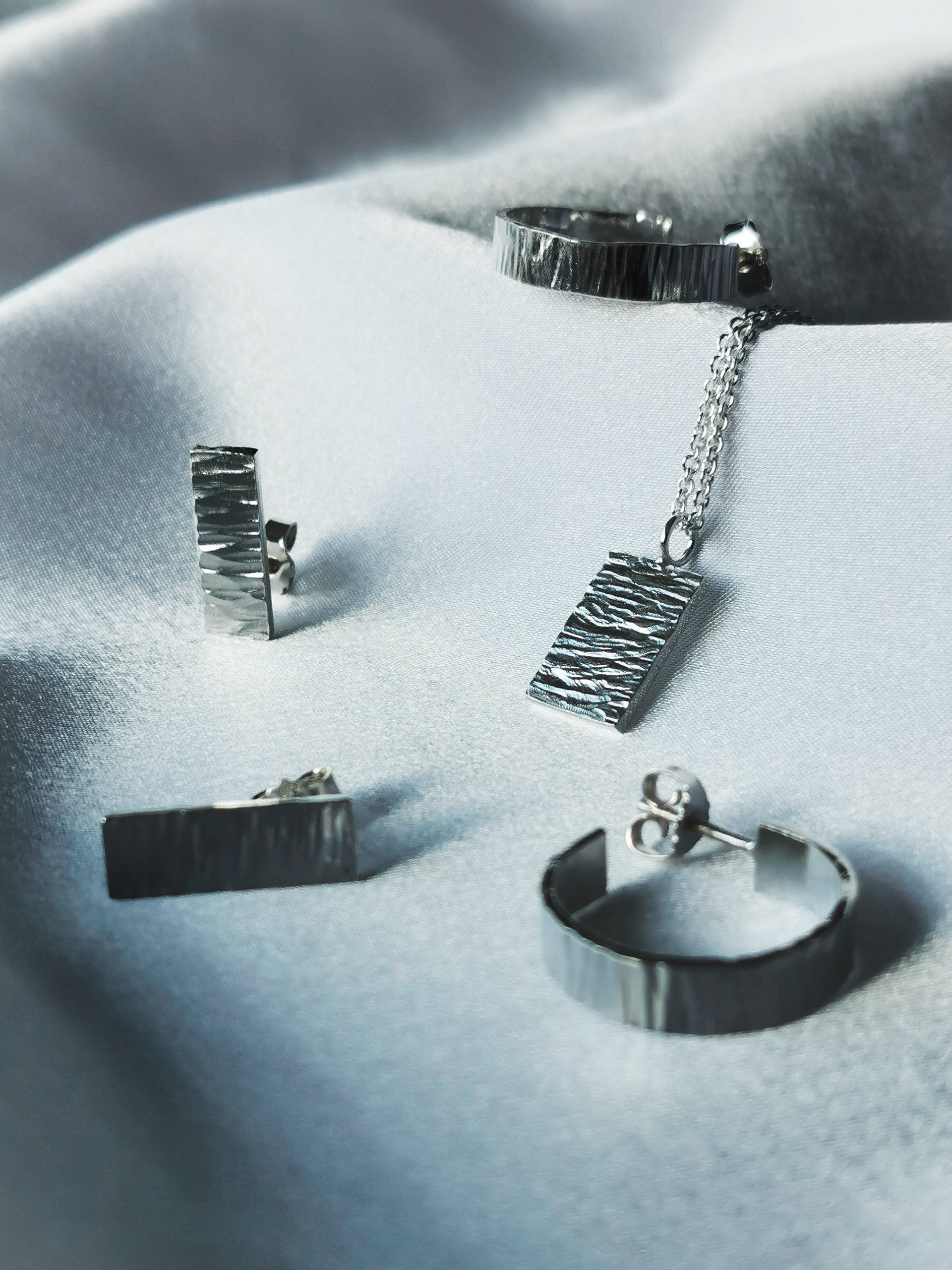
By Stine Winther is an ecommerce store selling clothes, jewelry and accessories for women. Stine cooperates with the big brands like Pieces, Vero Moda, Noisy May, but also smaller ones like BYIC and By Stær and is selling their products on her website. Additionally, she has her own brand By Stine Winther with her own clothes collection, Exclusive By Stine Winther with the gold and silver jewelry designed by her and Unika which is her own collection with hand-made earrings, necklaces and bracelets.
Her goal was to make her web shop more user-friendly to increase sales and decrease the bounce rate.
I redesigned the store with the focus on User Experience based on desk, qualitative and quantitative research.
My bachelor project for Digital Concept Development was created in a cooperation with By Stine Winther.
By Stine Winther is an ecommerce store selling clothes, jewelry and accessories for women. Stine cooperates with the big brands like Pieces, Vero Moda, Noisy May, but also smaller ones like BYIC and By Stær and is selling their products on her website. Additionally, she has her own brand By Stine Winther with her own clothes collection, Exclusive By Stine Winther with the gold and silver jewelry designed by her and Unika which is her own collection with hand-made earrings, necklaces and bracelets.
Her goal was to make her web shop more user-friendly to increase sales and decrease the bounce rate.
I redesigned the store with the focus on User Experience based on desk, qualitative and quantitative research.
Problem Description
For the past few years, shopping online has become more and more popular. People loved the idea of shopping anywhere, anytime and at any store in the world by using device like mobile, tablet or laptop. It became obvious, that any store needs to be able to sell online, or at least BE online, in order to survive. Nevertheless, the year 2020 was clearly an indicator of the online sales trend. A lot of countries decided for a full lockdown which caused the closure of stationary stores. It became a huge possibility for e-commerce, but since the competition is huge, it is important to be the cheapest, fastest and the most user friendly in order to get clients. My client’s store was designed with the theme Flatsome at the simplest of its complexity which made it not as advanced in UX as their competitors. It has to be improved in order to make shopping online easier, faster and minimize bounce rate of the potential customers.
Problem Formulation
How can I re-make an online store By Stine Winther in order to make it more user friendly for both desktop and mobile device?
Release of the concept (5 planes of UX)
#1 Strategy level. The product (website) was created to sell nice clothes, jewelry and accessories to women. The goal is to create a user-friendly web shop for desktop and mobile devices. Increasing user experience will lower the bounce rate and increase the revenue. There are two target groups: 14 – 24 years old women (Gen Z) and 25 – 34 years women (Millennials). Well-build and user-friendly web shop will help them to get new items in a quick and enjoyable way. They will use the website to make them feel happy with the new, trendy items in a good price without wasting time in a shopping center. They love to buy new clothes and jewelry because it feel nice to have something new and they express themselves by the way they are wearing.
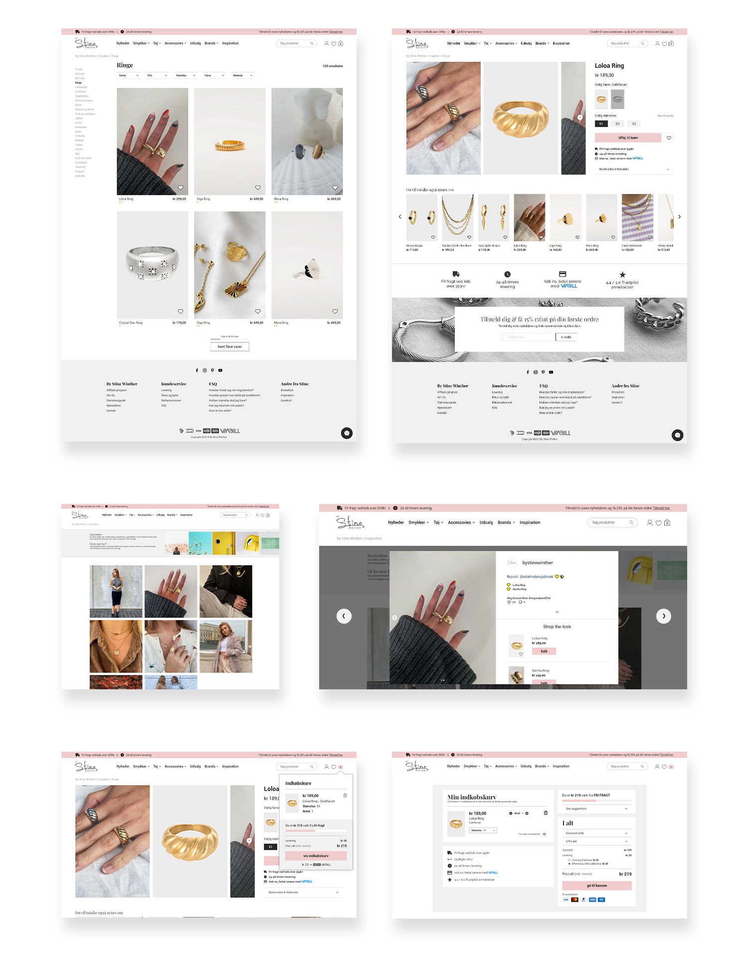
# Feature level. Functions that are needed to give the user a good user experience while shopping on By Stine Winther are: • Simple menu with seven items (plus or minus two) to be able for the user’s to keep them in their memory - Miller’s Law (lawsofux.com), • Easy navigation and natural flow between pages, • Big, nice pictures of the products from all sides and in different situations, as well as close pictures to show the material, • Descriptions of all products (material, sizes, model’s sizes, purpose/destiny), • Size guides, • Filters (color, size, material, price) with not too wide range (Hick’s Law – the time it takes to make a decision increases with the number and the complexity of choices), • Chatbot, • Clear overview over the basket, • Clear information about delivery time and costs, • FAQ section, • Option suggesting the users other products they might like based on previously seen items, • Allow users to make an account with saved information, previously bought products and tracking orders, but do not force them to make an account in order to make an order, • Inspiration page, • Keep sold out products at the end, • Product page should show the same products in different colors.
# Structure level. Architecture development helped to build a website’s architecture for user to use the minimum amount of time and the smallest number of steps. It is build based on the biggest brand’s websites in this industry which following Jakob’s Law will make it easy for the users to understand and find searched information, since they are used to their pages. On each page the users will have breadcrumbs to know where they currently are and to eliminate the feelings of being lost.
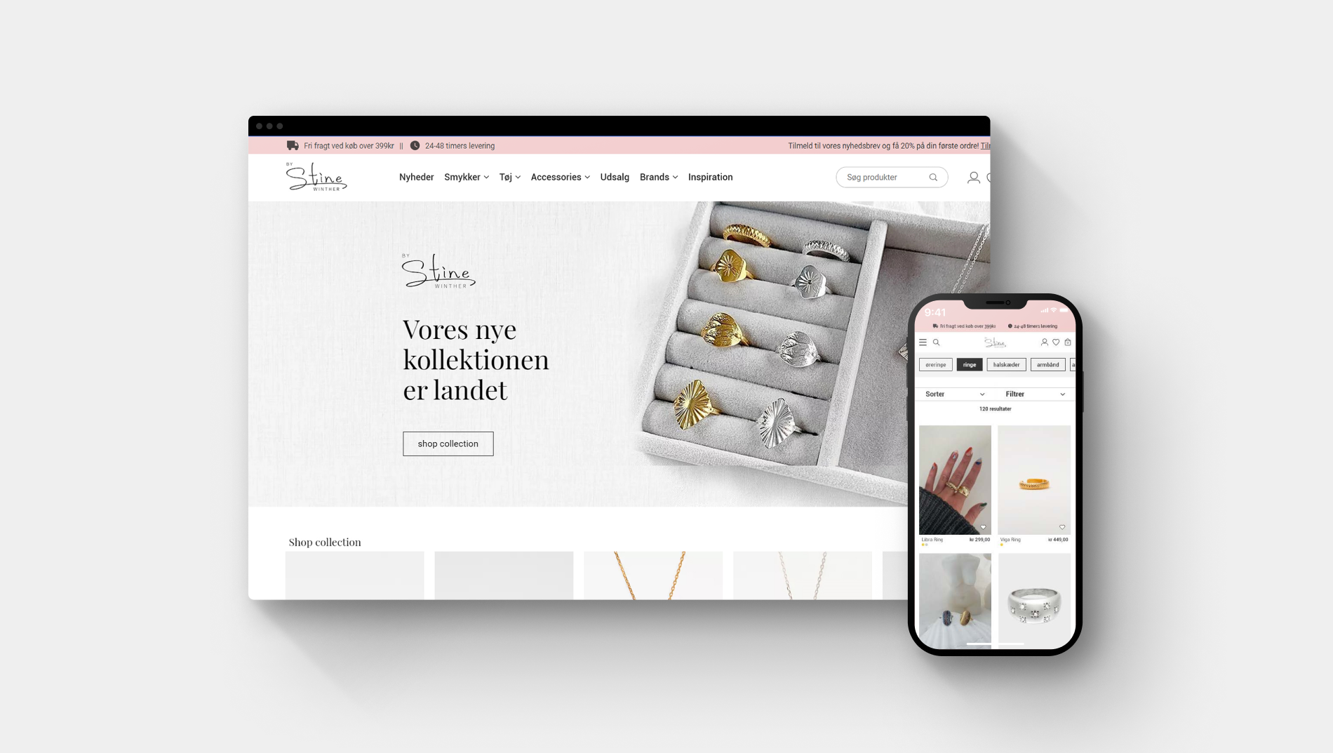
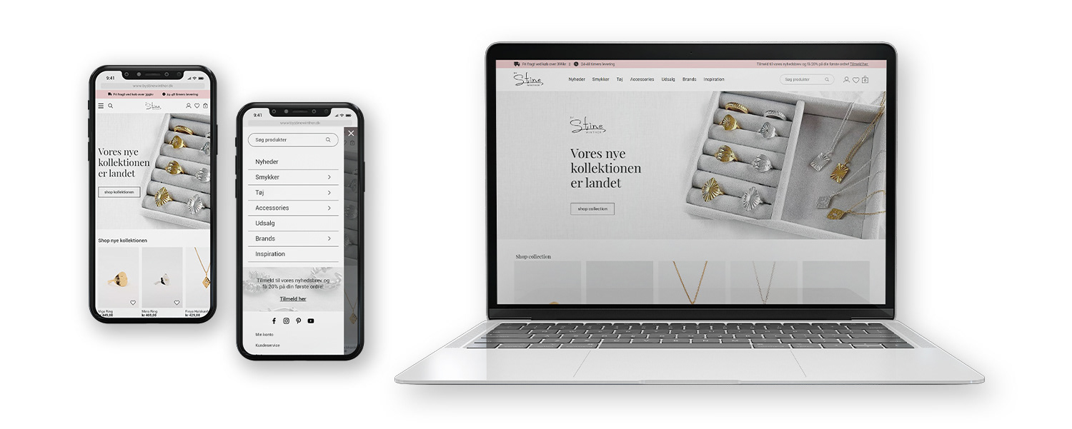
# Layout level. The prototypes were created on a website builder called WIX which is not allowing all the functions needed for a fully working high-fidelity prototype. Moreover, the mobile version was fully responsive and I was not able to add features to make shopping easier on a mobile device. I decided to use Adobe XD to present the mobile version of the web shop. In order to make it fully working prototype with all expected functions, it needs to be built in more advanced software, like WordPress with premium account. Current prototype is visual in order to explain how it should look and work in order to provide the best user experience.
# Surface level. A survey found that 58% of adults in the U.S. have experienced eye strain from working on computers. High colour contrast is useful for readability but pure black text on white backgrounds can cause eye strain when users read the text over an extended period (Rushabh, 2020). To eliminate this on my client’s website, I decided to make a clear and simple design with three main colours (dark grey, white, pink) and grey for the footer. Pink is a feminine colour with the meanings of beauty, friendship, sensitivity, faithfulness, which fits into the target group (Lasquite, 2016). Customers want to feel happy, beautiful and trendy. Interface is user-friendly and solves the problems described in the first levels. Full concept with the explanation of solving specific problems for the users can be found in a “Concept description” document. I believe that clear and simple design will help the users to shop faster and know where they are and where to find information they are looking for.
#1 Strategy level. The product (website) was created to sell nice clothes, jewelry and accessories to women. The goal is to create a user-friendly web shop for desktop and mobile devices. Increasing user experience will lower the bounce rate and increase the revenue. There are two target groups: 14 – 24 years old women (Gen Z) and 25 – 34 years women (Millennials). Well-build and user-friendly web shop will help them to get new items in a quick and enjoyable way. They will use the website to make them feel happy with the new, trendy items in a good price without wasting time in a shopping center. They love to buy new clothes and jewelry because it feel nice to have something new and they express themselves by the way they are wearing.
# Feature level. Functions that are needed to give the user a good user experience while shopping on By Stine Winther are: • Simple menu with seven items (plus or minus two) to be able for the user’s to keep them in their memory - Miller’s Law (lawsofux.com), • Easy navigation and natural flow between pages, • Big, nice pictures of the products from all sides and in different situations, as well as close pictures to show the material, • Descriptions of all products (material, sizes, model’s sizes, purpose/destiny), • Size guides, • Filters (color, size, material, price) with not too wide range (Hick’s Law – the time it takes to make a decision increases with the number and the complexity of choices), • Chatbot, • Clear overview over the basket, • Clear information about delivery time and costs, • FAQ section, • Option suggesting the users other products they might like based on previously seen items, • Allow users to make an account with saved information, previously bought products and tracking orders, but do not force them to make an account in order to make an order, • Inspiration page, • Keep sold out products at the end, • Product page should show the same products in different colors.
# Structure level. Architecture development helped to build a website’s architecture for user to use the minimum amount of time and the smallest number of steps. It is build based on the biggest brand’s websites in this industry which following Jakob’s Law will make it easy for the users to understand and find searched information, since they are used to their pages. On each page the users will have breadcrumbs to know where they currently are and to eliminate the feelings of being lost.
# Layout level. The prototypes were created on a website builder called WIX which is not allowing all the functions needed for a fully working high-fidelity prototype. Moreover, the mobile version was fully responsive and I was not able to add features to make shopping easier on a mobile device. I decided to use Adobe XD to present the mobile version of the web shop. In order to make it fully working prototype with all expected functions, it needs to be built in more advanced software, like WordPress with premium account. Current prototype is visual in order to explain how it should look and work in order to provide the best user experience.
# Surface level. A survey found that 58% of adults in the U.S. have experienced eye strain from working on computers. High colour contrast is useful for readability but pure black text on white backgrounds can cause eye strain when users read the text over an extended period (Rushabh, 2020). To eliminate this on my client’s website, I decided to make a clear and simple design with three main colours (dark grey, white, pink) and grey for the footer. Pink is a feminine colour with the meanings of beauty, friendship, sensitivity, faithfulness, which fits into the target group (Lasquite, 2016). Customers want to feel happy, beautiful and trendy. Interface is user-friendly and solves the problems described in the first levels. Full concept with the explanation of solving specific problems for the users can be found in a “Concept description” document. I believe that clear and simple design will help the users to shop faster and know where they are and where to find information they are looking for.
Conclusion
The aim of the project was to find a solution for remaking the web shop By Stine Winther in order to make it more user friendly for the customers. After the quantitative, qualitative and desk research, I was able to gather all the data and find user’s pains, gains and jobs they want to fulfill. With the help of models, I could find the solutions for better e-commerce user experience through special features and functions on the website. Jakob’s Law was main UX theory that the project was based on. I prepared high-fidelity mock-ups without full functionalities because of the software. I approached and executed tasks needed to finish the project with the main focus on the users.
The aim of the project was to find a solution for remaking the web shop By Stine Winther in order to make it more user friendly for the customers. After the quantitative, qualitative and desk research, I was able to gather all the data and find user’s pains, gains and jobs they want to fulfill. With the help of models, I could find the solutions for better e-commerce user experience through special features and functions on the website. Jakob’s Law was main UX theory that the project was based on. I prepared high-fidelity mock-ups without full functionalities because of the software. I approached and executed tasks needed to finish the project with the main focus on the users.
Check how By Stine Winther looked like 'before' and 'after'.